Painting subjects
Color and mixing
Explore Gábor’s articles and free videos about color, paint mixing, and working with a palette.
I think about color in relation to the other passages in the painting. A green can feel warmer or cooler beside another green, and a small stronger color can gain emphasis from quieter colors around it. These notes explore those comparisons through specific landscape examples.
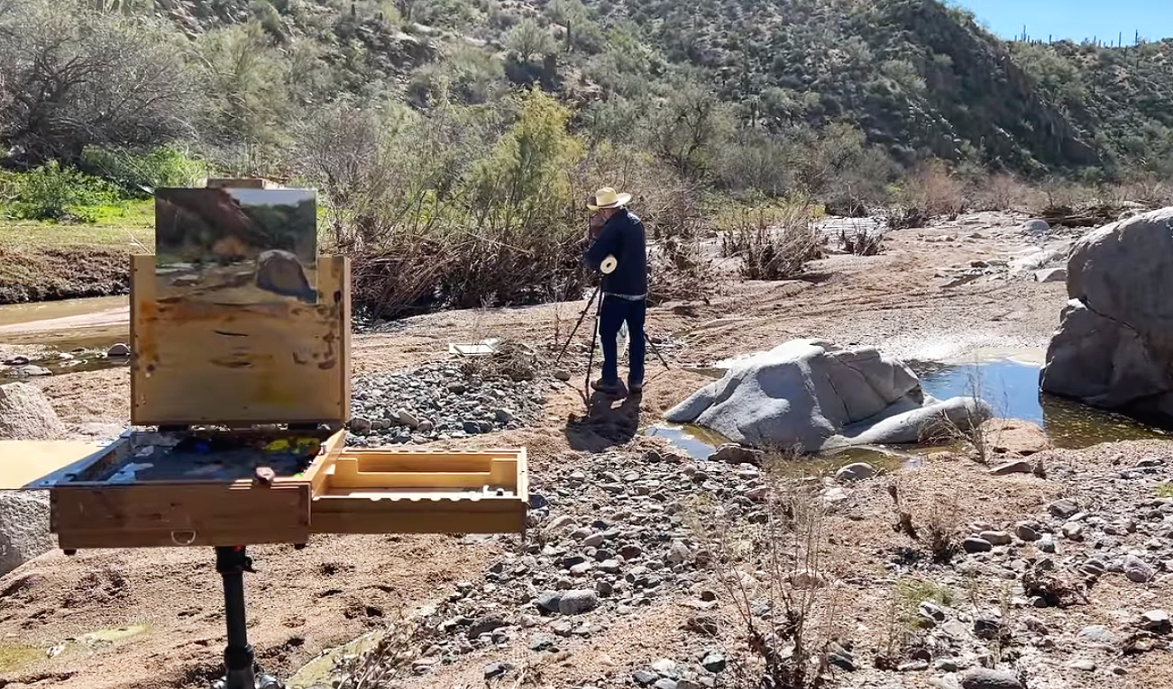
In the river landscape, I discuss the warmer greens toward the front and cooler mixtures farther back. The written green-mixing article offers another comparison from my own practice, using different dark ingredients and watching the value change as yellow is added. These are examples to examine, rather than one mixture for every landscape.
The discussion of grays looks at intensity: surrounding a stronger note with quieter color can help that note stand out. Read these together with attention to both temperature and value. The useful question is how a mixture works within the picture, not just how attractive it looks on the palette.
Start here
- How to Make Green Recede
Compare warmer foreground greens with the cooler passages farther back in one river landscape.
- Creating a Warm or Cool Green
Read how I compare green mixtures while also watching their changing values.
- Utilizing Gray's in Your Work
Consider how quieter surrounding colors help a stronger color note stand out.
Explore the articles
All articles and free videos →
 From the studio
Pre-Mixing Colors vs. Mixing as You Go: Which Is Better?
Read the story →From the studioPainting Big Won't Fix Weak Fundamentals — Here's What Will
Read the story →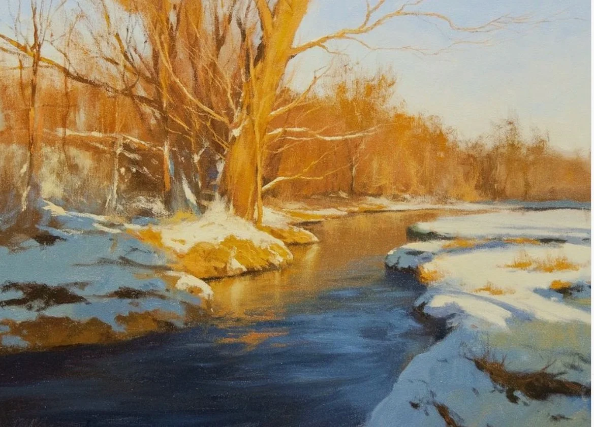 From the studio
Why Your Painting Feels Flat: It's Value, Not Color
Read the story → From the studio
How to Make Fall Landscape Colors Pop in Painting
Read the story →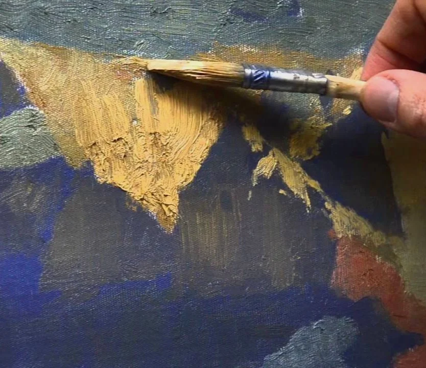 From the studio
Using Texture in Oil Painting: When and How to Explore It
Read the story →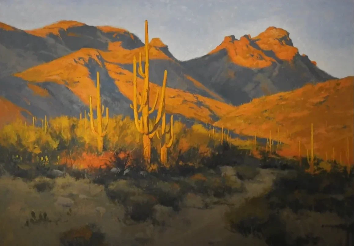 From the studio
Should You Focus on Brushwork? It Depends on Your Skill Level
Read the story →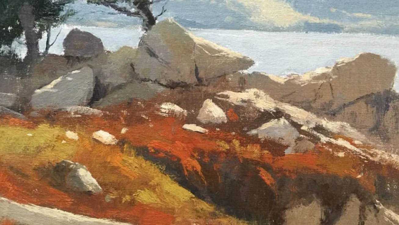 From the studio
Creating a Cool Red
Read the story →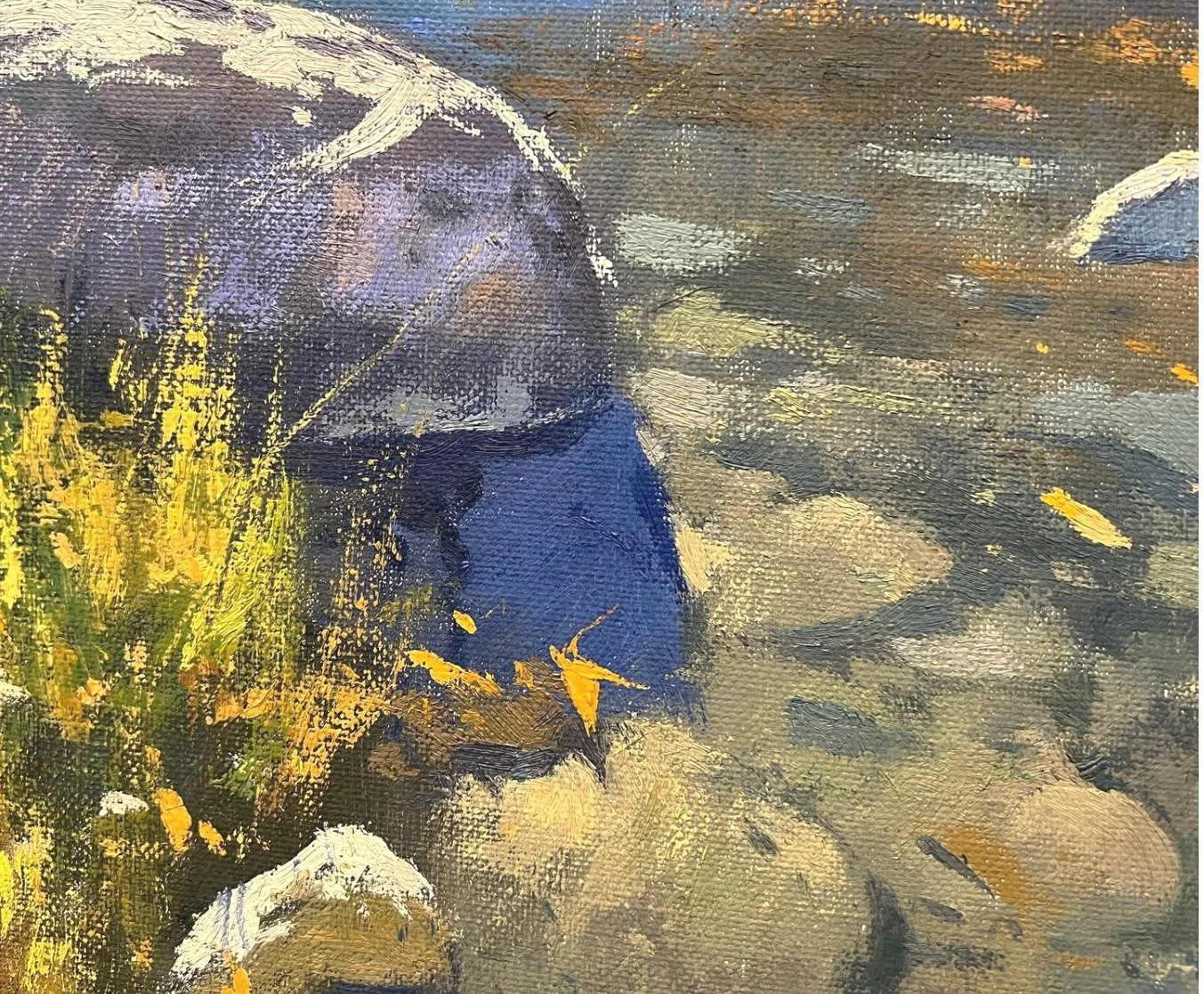 From the studio
Muted Colors, Softer Edges
Read the story → From the studio
Mixing Raw Umber
Read the story → Video & notes
Reflections on Boats
Watch & read →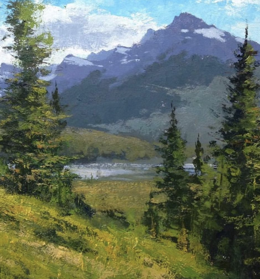 From the studio
Creating a Warm or Cool Green
Read the story →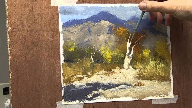 Video & notes
Painting Large vs Small
Watch & read →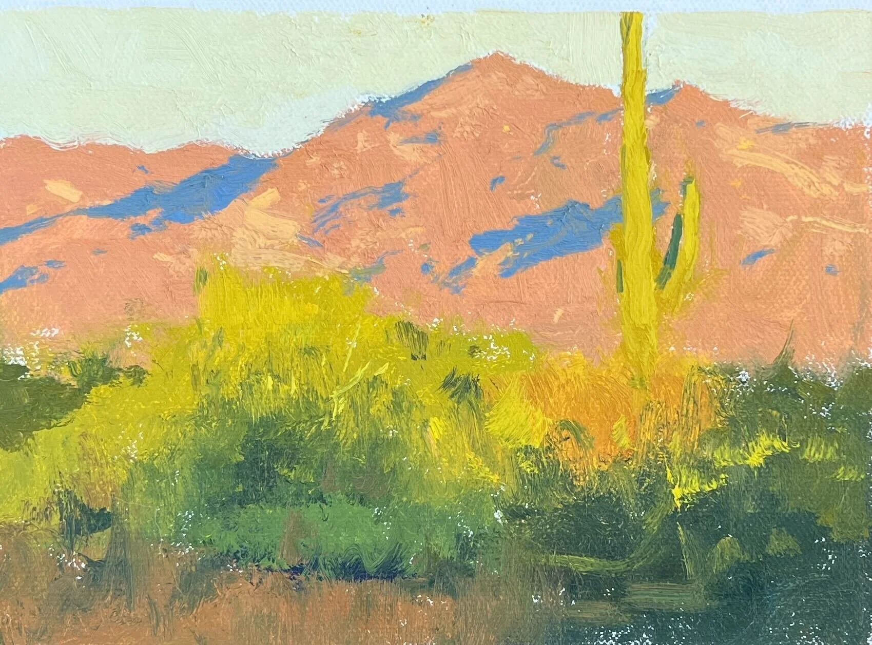 From the studio
Which Yellow Should I Use?
Read the story → From the studio
Utilizing Gray's in Your Work
Read the story → From the studio
Using Glass as Your Palette
Read the story → From the studio
Spend Time on Design
Read the story → From the studio
3 Keys to a Successful Painting
Read the story → Video & notes
Value first Color Second
Watch & read → Video & notes
How to Paint the Sky - Value & Color
Watch & read → From the studio
2 Ways to Keep Your Colors Clean
Read the story → Video & notes
[ Design ] How much sky to leave in
Watch & read →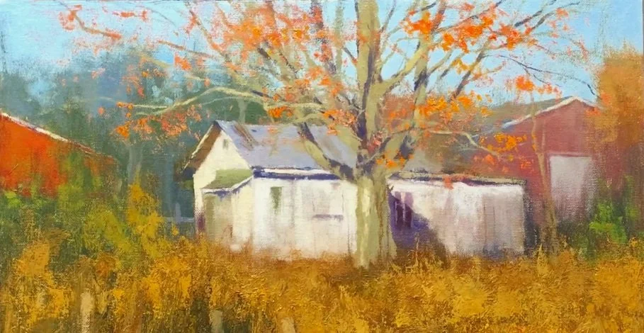 Video & notes
Keeping [ Detail ] to a minimum
Watch & read →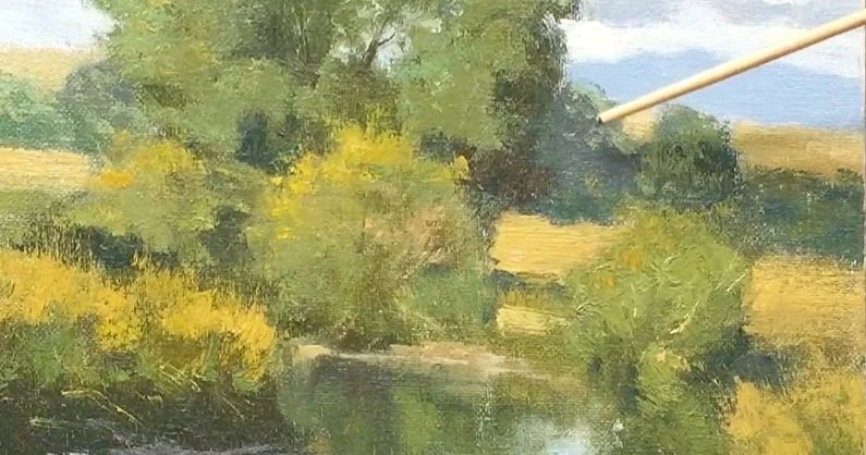 Video & notes
How to Make Green Recede
Watch & read →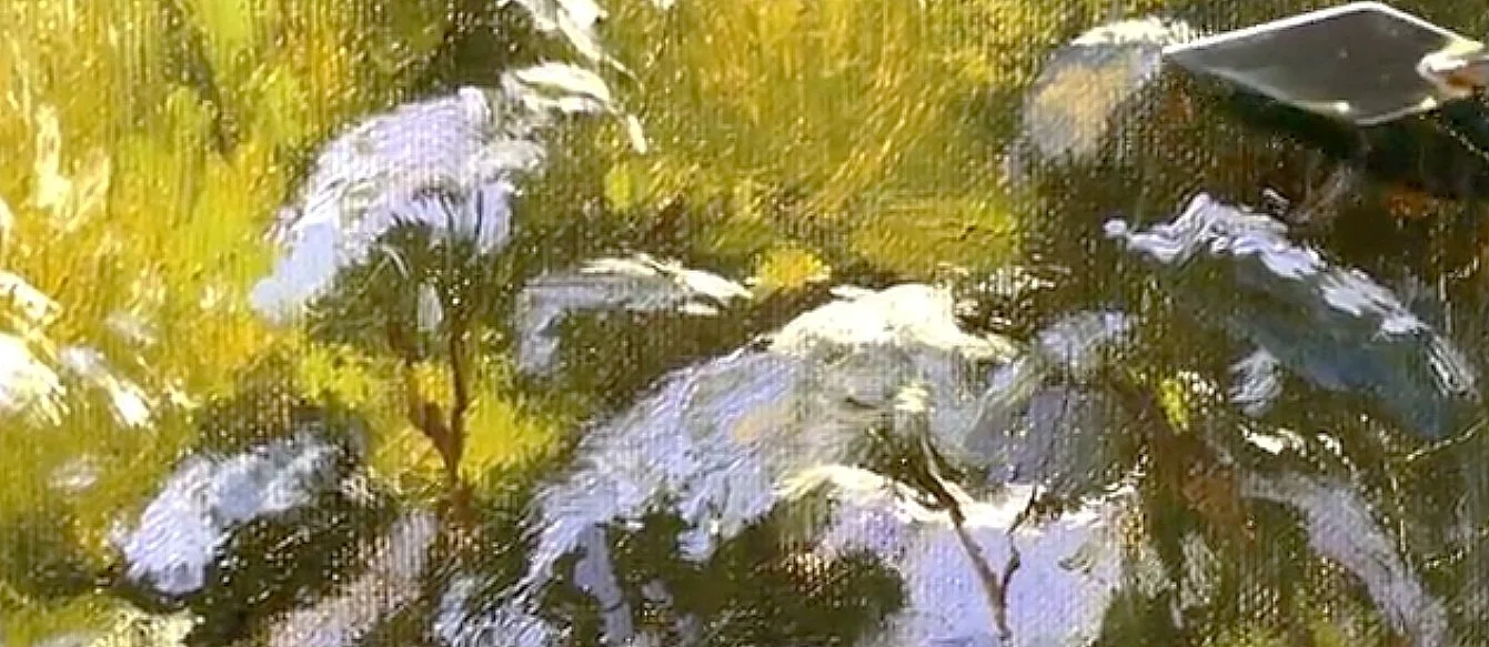 Video & notes
How to use your palette knife with wet paint
Watch & read →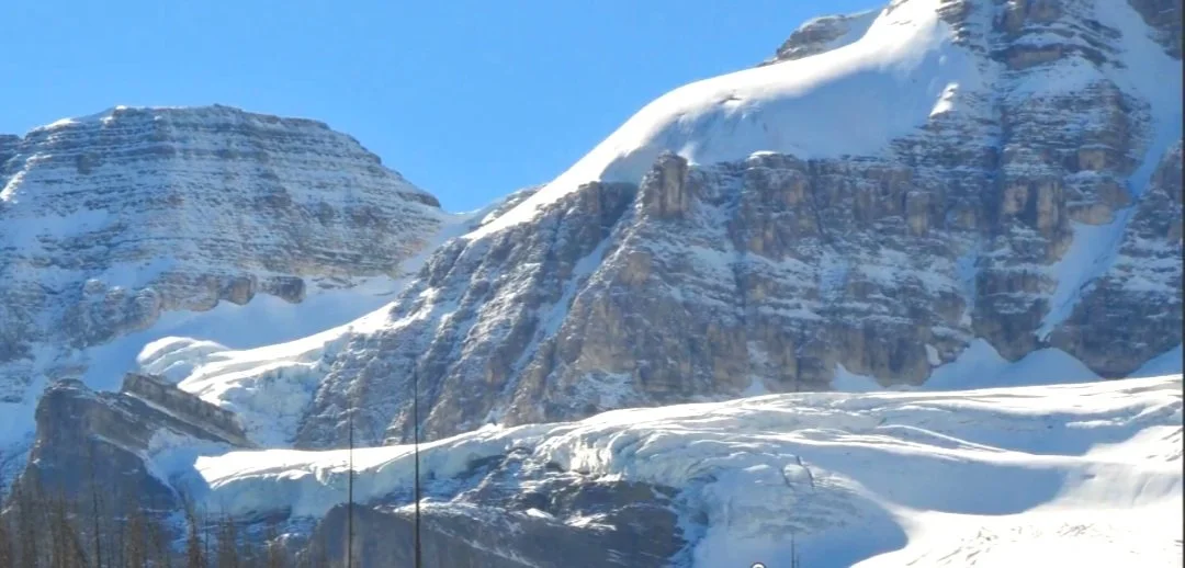 Video & notes