
How to Make Fall Landscape Colors Pop in Painting
Fall's vivid colors make it a favorite season for landscape artists. Two techniques — using gray tones and paint transparency — help bright fall colors stand out on canvas.
Technique 1: Use Gray to Make Bright Colors Pop
Why it works: Placing gray around a bright color makes that color look more vivid by contrast. The gray tones down the surrounding area, so the bright color pops even more when added.
How to do it:
Start with darker, less vibrant colors in the area you'll be painting (e.g., a maple tree).
Layer your brighter colors — like orange or yellow — on top.
The contrast between the muted base and vivid top layer makes fall colors feel more intense.
Best for: Painting maple trees or other high-contrast foliage.
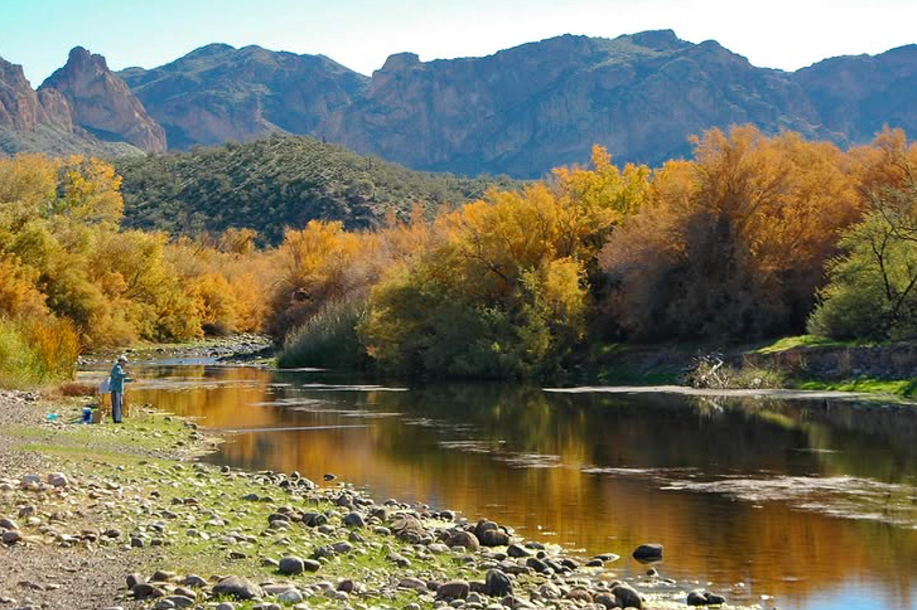
Technique 2: Use Paint Transparency to Create a Glow
Why it works: Letting the canvas show through certain areas creates a natural glow, since transparent colors read as brighter and more luminous than opaque ones.
How to do it:
Apply a light-to-medium wash first (a yellow-orange works well).
Avoid covering it with too many opaque colors — opaque paint blocks the canvas and dulls the brightness.
Paint dark values around the transparent wash to make it appear to glow.
Best for: Studio or outdoor fall scenes where you want a luminous, glowing effect.
Quick Summary
Gray contrast: Paint a dark, muted base first, then add bright colors on top — this makes the colors look more vivid.
Transparency: Apply a light wash and surround it with dark values — this creates a glowing effect.