
Clouds and Skies: From Observation to Canvas
“Master the most expressive subject in landscape painting”
Clouds are one of the most challenging — and most rewarding — subjects you'll ever tackle as a landscape painter.
They move, they shift, they change value from one minute to the next. And yet when you get them right, they're what make a painting come alive.
In this video oil painting package, I take you through my complete process for painting skies that feel atmospheric, honest, and true to what you actually see in nature. I'm not going to give you a formula. What I'm going to show you is how I think — how I look at a stormy sky or a patchwork of clouds rolling in and decide what stays, what goes, and what the painting is really about.
We'll work small, on 6x8 canvases, because I believe you learn faster that way. You'll see how I establish my darkest darks first and judge every other value against them. You'll watch me work wet into wet, keeping edges soft and the paint alive. And you'll hear me talk through every decision as I make it — the color mixtures, the brush choices, when to push and when to leave it alone.
No matter where you live or what skies you paint under, the principles are the same. If you've been avoiding the sky in your paintings, or painting it and not liking what you get, this is where that changes.

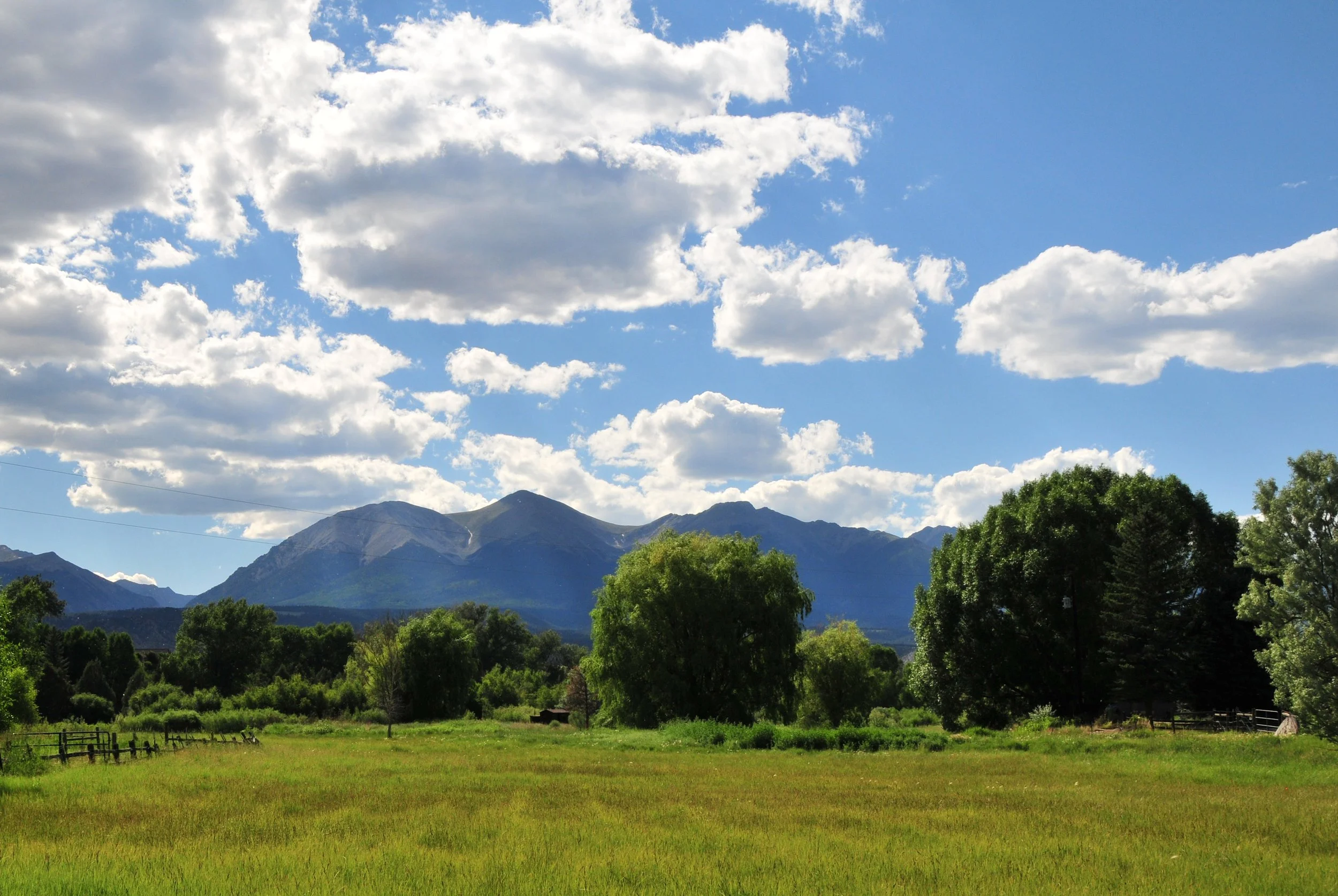
Summer Skies
60 min
This demonstration walks through painting a summer landscape with a major focus on designing and painting the sky and clouds. The artist explains a specific color palette, how to mix warm vs. cool greens, and how to plan a strong composition with clearly separated cloud and land shapes. A big emphasis is placed on establishing good value relationships (especially keeping cloud darks lighter than tree darks), working wet-on-wet without muddying the paint, and simplifying details by focusing on big shapes, clean color, and overall balance.

Sunset Clouds
60 min
Discover how to paint glowing sunset clouds with more clarity, confidence, and stronger design. In this video, I walk you through my full process for building a dramatic sky from the ground up—starting with dark-to-light value relationships, simplifying big shapes, controlling color temperature, and creating the illusion of light without overworking the painting. Along the way, I also share practical insights on palette choices, brush handling, edge control, and why value matters even more than color when painting skies that truly feel luminous.
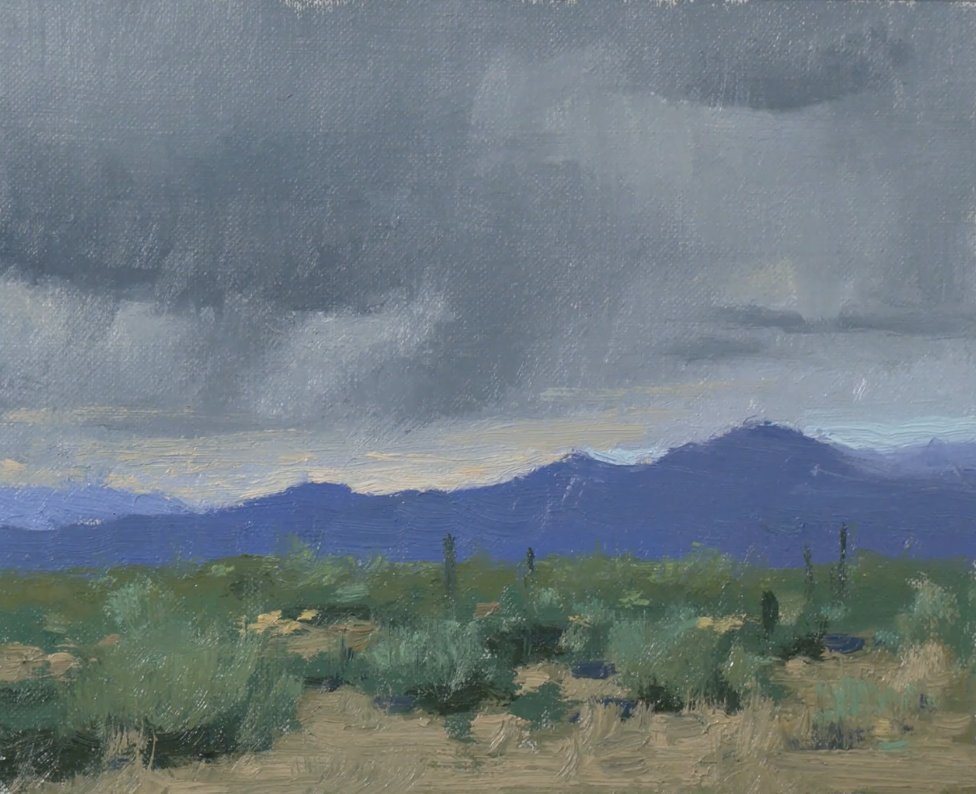
Stormy Skies
60 min
In this demonstration I take on one of the most dramatic subjects in landscape painting — a storm rolling in, rain hanging in the air, dark mountains pushing up against a turbulent sky.
I'll show you how I simplify a scene like this from the very beginning — how I set up my composition with a low horizon line to give the sky room to breathe, how I establish my darkest darks first and build every other value from there, and how to work wet into wet so your clouds stay soft, atmospheric, and alive.
You'll watch me mix color on a simple palette, choose the right brush for each moment, and make the kinds of decisions that separate a painting that feels like a storm from one that just looks like a photograph of one.
If stormy skies have ever felt too complicated or too unpredictable to paint, this is the demonstration that will change that.

Sunset Rays
60 min
In this demonstration I paint one of the most tempting — and most easily overdone — subjects in landscape painting: a powerful cloud lit from behind by a setting sun, with warm light glowing along its edges and spilling across the sky.
I'll show you how I approach a dramatic scene like this without letting it turn gimmicky. You'll watch me establish the dark sky value first — because if that isn't dark enough, the rim light around the cloud simply won't show. From there I'll walk you through how I handle the transition from cool to warm across the sky, how I keep the values inside the cloud close enough to feel dimensional without looking choppy, and how I suggest the sun's glow without spelling it out.
Wet into wet throughout. Big shapes first. And a constant reminder to step back, squint, and let your eye connect the dots rather than overworking every inch of it.
If you've ever painted a sunset and felt like it looked too generic, too forced, or just a little too much — this is the demonstration that shows you a better way
-
All of the demonstrations in this package are done in oil paint. I'll walk you through my complete palette — the specific colors I use, how I mix them, and why. You don't need a lot of materials. A simple, well-organized palette and a few good brushes are all it takes to get started.
-
Description text goes here
-
Description text goes here