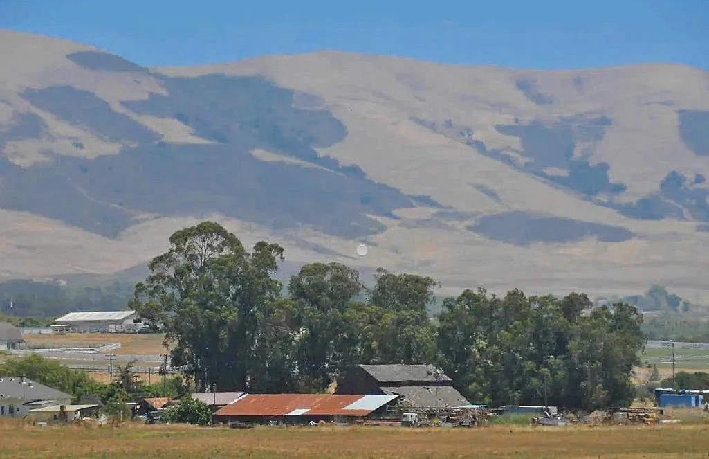
When a reference photograph feels washed out, I test whether stronger darks would improve its value structure. In this example, I darken the nearer trees and explore the foreground so the distant hills feel farther away.
Identify the opportunity in the photograph
I like the scene, but the values lack some of the strength I want. That does not mean every painting needs strong contrast. It means this particular reference has a possibility I want to investigate. Before reaching for more intense color, I look at the light and dark relationships.
Test darker tree masses
Using Photoshop, I roughly block darker greens over the tree group and compare the result with the original. This is a quick test rather than a finished digital painting. The stronger near darks help the lighter hills recede, making the depth more apparent. I also acknowledge that the test may be pushed farther than I would ultimately choose.
Consider foreground color afterward
After the value test, I explore a little more color in the foreground. Switching back and forth lets me judge the difference instead of relying on memory. The useful practice is to revisit a promising photograph and ask whether adjusting its darks would better express what attracted me. I want color to build on that decision, with the value relationships doing their part first.
For a related lesson, see making distant objects recede.