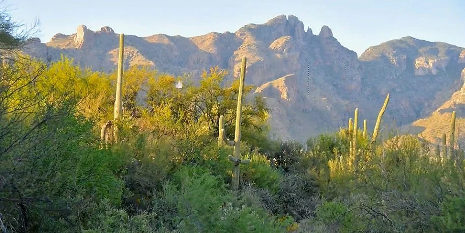
In this desert landscape, lighter values and cooler color help the mountain recede behind the foreground vegetation. I use digital samples to make those relationships easier to compare.
Separate the distant and nearby darks
The mountain’s values are lighter than the dark foreground greens. If I let those values become too similar in a painting, the space between them becomes less convincing. I move a sample from the mountain across other areas of the photograph so you can see the difference directly.
Check temperature as well as value
When the mountain sample reaches the ground, the values become more similar, but the temperature difference remains clear: the ground is warmer. I also take a foreground green and move it toward the mountain to show how much darker it is. The comparisons keep me from relying on the name of a color or the identity of an object.
Let value lead the decision
Color naturally attracts the eye, but I want to check value first, then temperature. In the scene shown here, the distant mountain is lighter and cooler relative to the foreground. Those are the relationships I need to carry into the painting if I want that depth. Squinting and comparing passages helps me judge them. Watch what changes when the same sample is placed against different surroundings, rather than looking at each area on its own.
For a related lesson, see spatial perspective in three landscape photographs.