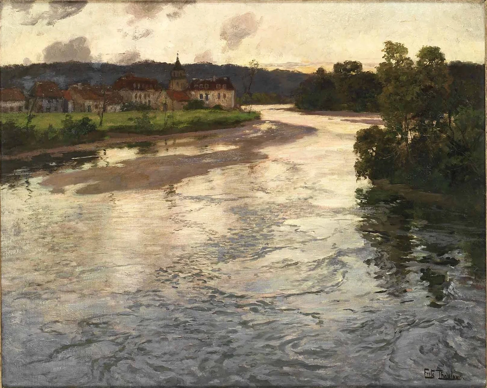
What I admire in the Thaulow paintings shown here is the way quieter water passages support the movement in the foreground. I look at three examples and share my own reading of how those choices guide the eye.
Compare quiet water with active water
In each example, I point out a relatively simple passage farther back and more visible movement toward the front. In one painting, calmer water near the edge also gives room for the reflection of a building.
The contrast matters. If every part of the water received the same amount of activity, the eye would have fewer places to rest and less reason to settle in a particular area. Here, quieter passages help the busier ones speak.
Choose where the marks belong
My interpretation is that these arrangements help hold attention in the foreground. That is my view as a painter looking at the work, not a statement of the artist's documented intentions.
When painting water yourself, consider where you want the movement to be most apparent. Brush marks and stronger light-dark contrasts can become part of that decision. These examples remind me to simplify and organize what I see, rather than automatically give every ripple in a reference the same weight within the picture.
Continue with video How much detail is too much? and Why You Should Pay Attention to Patterns.