To make the light foreground and autumn trees stand out in this painting, I first consider the darker values around them. Color helps, but the relationship between light and dark does much of the work.
Compare the foreground with the mountains
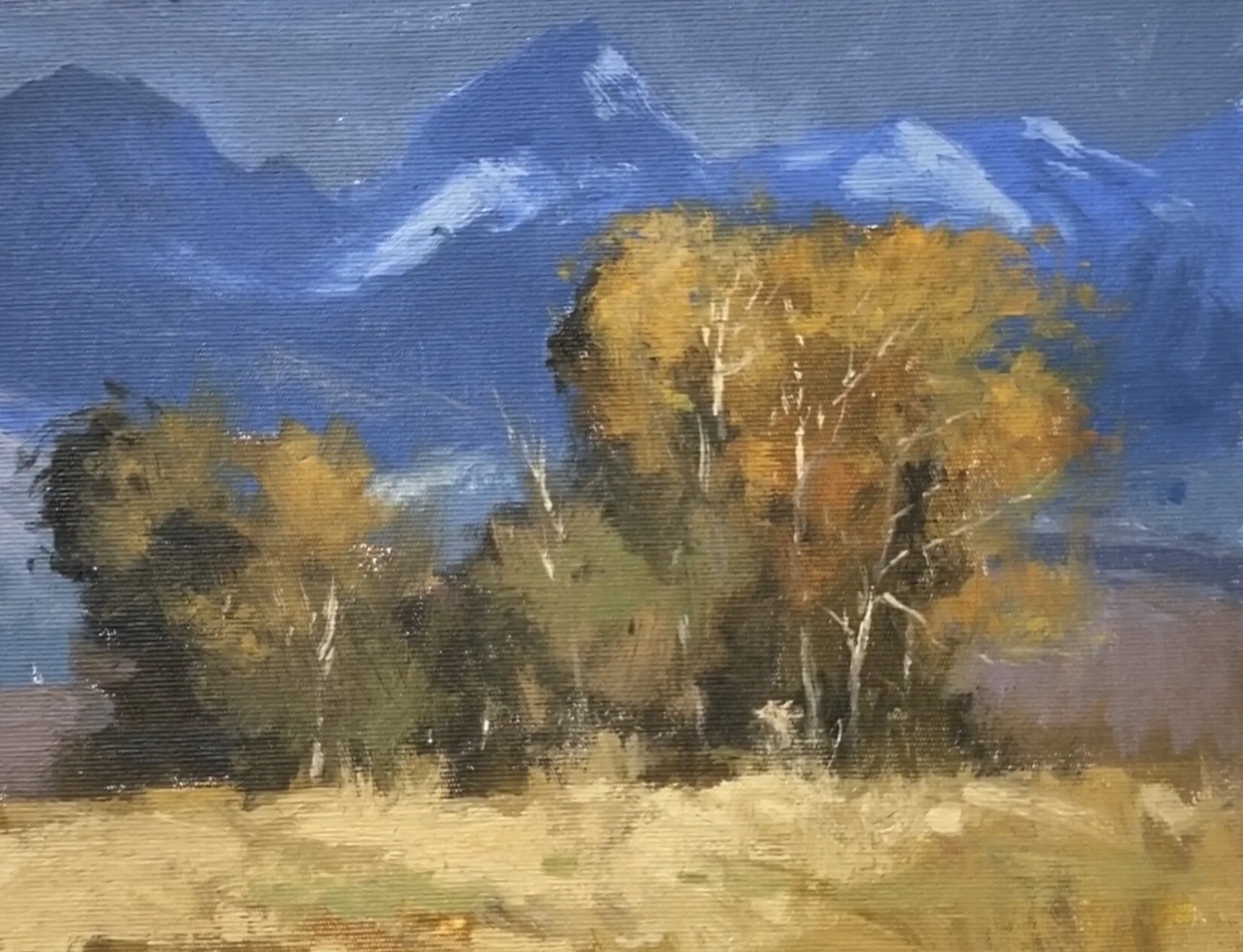
The scene shows light in the foreground against darker mountains and an approaching storm. That contrast is what attracted me. I point to the light tree and to a nearby dark accent that helps it stand out. The foreground dark is deeper than the darks in the distant mountain, so the relationship also supports the sense of distance.
Use temperature as another relationship
The mountain area is cooler, and the yellow-orange tree feels warmer beside it. The tree’s color does not have to be extremely intense to create that effect. Compared with a purer color, it could appear quite subdued, yet in this setting the cool surroundings make it read as warm.
Ask which change will help the light
When I want a passage to become more prominent, it is tempting to reach immediately for stronger color. In this example, I look first at whether the surrounding darks are sufficient. I still pay attention to color and temperature, but I want them to build on a clear value structure. As you watch, compare the tree with both the mountain behind it and the smaller dark notes nearby.
For a related lesson, see sky value and color.