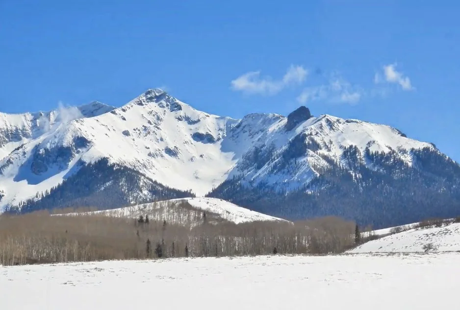
I judge the sky’s value before adjusting its color. In this demonstration, I use a snowy mountain photograph in Lightroom to show how a darker sky can make the sunlit snow appear more prominent.
Compare the light and dark relationship
As I adjust the photograph, the snow stands out more strongly when the surrounding values become darker. Moving in the other direction washes that relationship out. Some controls also affect other parts of the photograph, so this is a visual comparison of possibilities rather than an isolated paint mixture.
Explore color after the value
Once I have looked at the value, I experiment with the sky’s hue and saturation. I can make it more purplish, greenish, or blue and increase its intensity. Those changes add another kind of interest, but in this example they do not produce the same effect on the snow’s prominence as the value adjustment does.
Use the comparison to make a painting decision
I show before and after views side by side so the relationship is easier to assess. A reference photograph is a starting point: I can decide to paint the surrounding areas darker if that supports the light I want to emphasize. As you watch, distinguish the change in how dark the sky is from the change in its color. That order of thinking helps me make a clearer decision about the painting.
For a related lesson, see value first, color second.