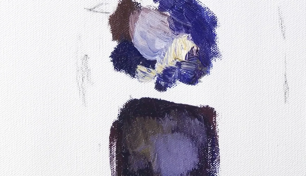
I keep value differences within a shadow relatively close when I want that shadow to remain a quieter part of the painting. In this small painted demonstration, I compare large value jumps with a more restrained range.
See what a large jump does
I begin with several strongly different values placed together. The light marks stand out sharply against the dark ones. If I use that kind of contrast inside a shadow passage, it can pull attention into the shadow and break up its unity.
Keep variation without breaking the group
Below the first example, I lay down a darker shape and add values that are closer to it. There are still differences inside the passage; I am not asking for a single flat color. The changes simply stay more subtle, so they remain part of the same larger shadow statement.
Use the numbers as a comparison
I describe the darker starting value as something like an eight, with nearby values such as seven and six. I contrast that with the much larger jump to four or three. Those numbers help explain the relative spacing I am demonstrating. The important thing to watch is the relationship between the marks, and how much attention each example attracts. This lesson is specifically about managing variation within a shadow, where an unexpectedly light note may become more prominent than I intended.
For a related lesson, see seeing value changes within a form.