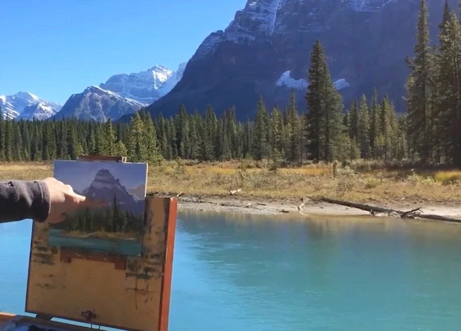
In this mountain scene, I establish a dark foreground value first and compare the distant values against it. The pine trees give me a useful reference for judging the much lighter, bluer mountains.
Find a value you can judge
I recorded this beside a river in the Canadian Rockies, where the difference between the foreground trees and distant mountain faces is especially clear. I find the dark green of the pines easier to judge than the distant blues.
I begin with a few of those foreground values, rather than finishing the whole foreground. They give me an anchor against which I can compare what sits behind them.
Build the distance by comparison
With the dark tree value established, I work back into the scene. In this particular view, I do not want the distant mountain shapes to become as dark as the foreground pines. Their relationship is part of what makes the distance convincing.
I briefly show the small painting I made of the scene and explain that I began with the darkest pine-tree passage. If you face a similar arrangement, try finding a clear foreground reference before tackling the more difficult distant values. The important part is the comparison, not finishing one object before you look at the rest.
Continue with Adding right value relationships and Why Values in Mountains Have to Be Close.