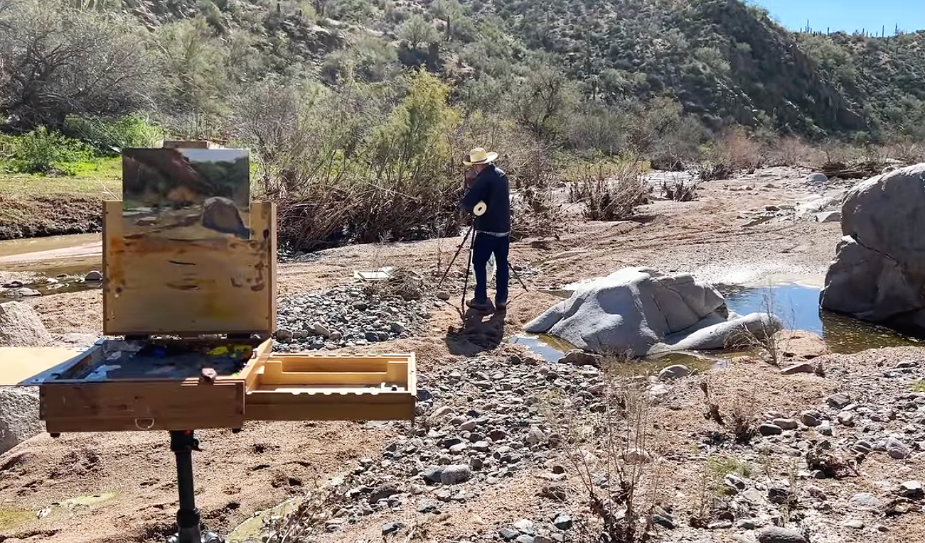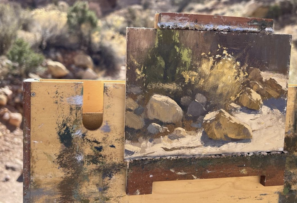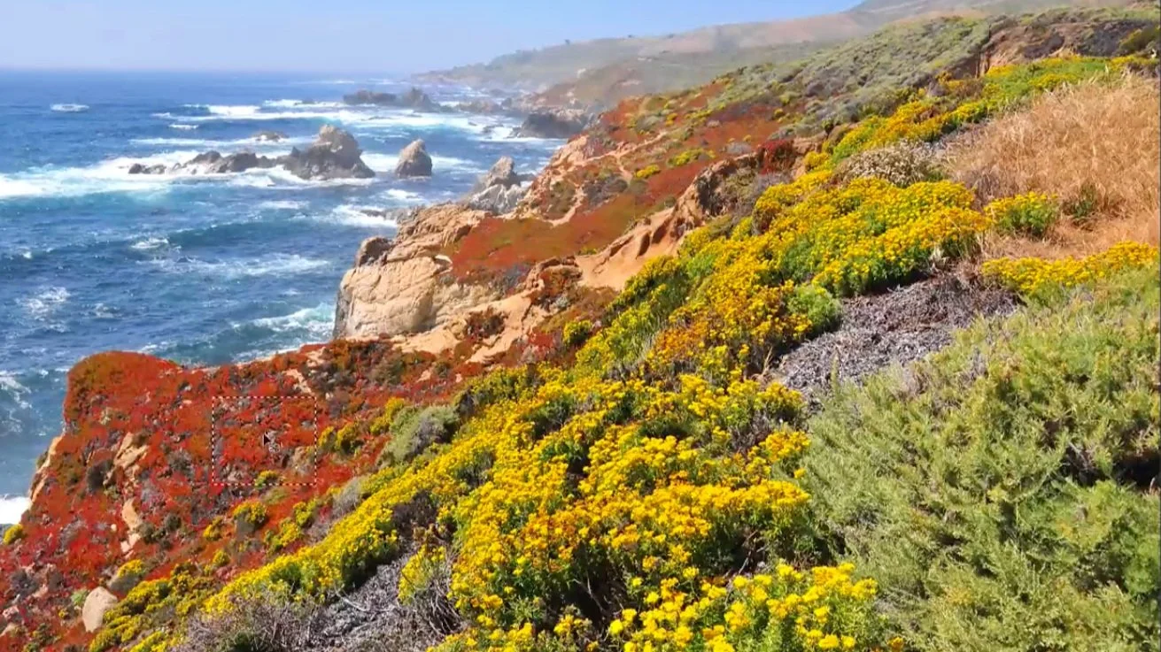
To show distance in a landscape, I compare the color and value of nearby subjects with similar subjects farther away. The three photographs in this lesson make those changes particularly easy to see.
Compare the same kind of tree
In the snowy mountain scene, the foreground evergreens have stronger, darker color than the trees farther back. I move a small sample from a nearby tree into the distance so the difference becomes obvious. In this photograph, the distant trees are lighter and cooler. Painting them all with the foreground mixture would lose much of that sense of space.
Follow the coastal colors back
The second photograph looks along a coast with colorful vegetation in front. I compare a foreground red passage with a more distant area. The farther color is quieter and lighter, even though the distance between the two areas may not initially seem very large. That comparison matters more than assuming every patch of similar vegetation should be painted alike.
Observe the atmosphere in each scene
The third view uses trees across a landscape to make the same comparison. In these examples, blues become more noticeable and colors more subdued as the landscape recedes. I want you to look for those relationships in the scene you are painting. We work on a flat surface, and observing changes in value, temperature, and color gives us a way to convey depth.
For a related lesson, see making objects recede.