I use thick and thin paint together to give the eye variety as it moves through an oil painting. Correct value and color matter, but the physical surface of the paint also contributes to the experience.
Give the eye a resting place
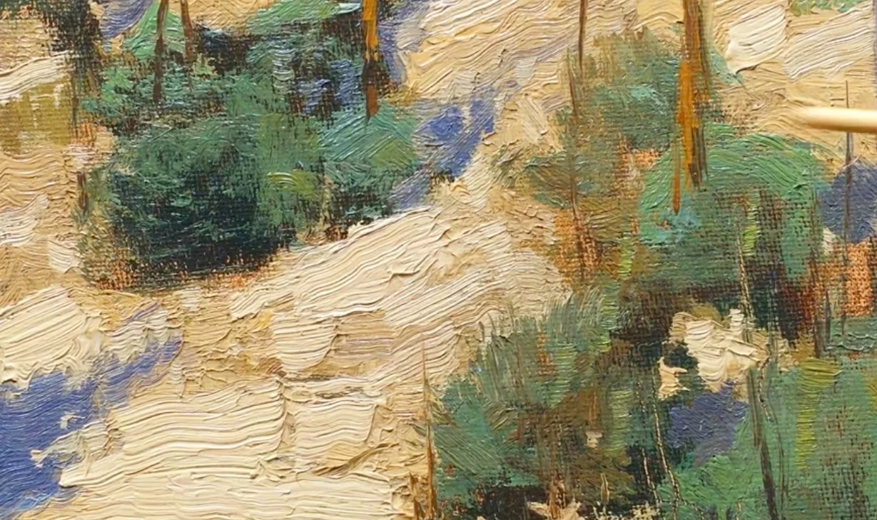
The studio light in this close view makes the built-up paint easy to see. Beside those heavier passages, the bush area is painted more thinly. It still has color and value, but it does not have the same raised texture. To my eye, that quieter surface provides a place to rest before moving into the thicker paint again.
Vary the surface deliberately
I explain why a uniformly heavy surface can feel tiring to me. If every passage asks for attention in the same way, I lose that change of pace. Rather than treating texture as something to spread evenly everywhere, I want it to help guide the viewer through the painting.
Compare the light and shadow passages
In this example I build up a light passage and keep the nearby shadow thinner. Thicker lights and thinner darks are a useful approach in my work, but I also say that this can be varied. Watch the contrast between the raised light paint and the quieter green passages. Their relationship is the point of the demonstration, rather than a requirement to give every painting the same surface.
For a related lesson, see working into wet paint with a palette knife.