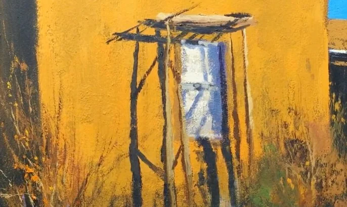
In this square painting, I balance the design by making the shapes unequal. I compare the widths of the dark areas, the size of the wall and foreground, and the small opening of sky before getting caught up in the subject.
Compare the dark shapes
The dark shape on the left is wider than the dark area on the right. I made that choice consciously. If the two sides had matched, the painting would have felt too centered, with a goalpost-like arrangement around the building.
The square gives me equal sides to begin with, so I pay close attention to the differences within it. I look at how one shape relates to another rather than assuming that equal amounts will create the balance I want.
Let small shapes have a purpose
The small cool sky area plays against the much larger warm wall. The window is another small shape, and it is part of the story of the painting. I also compare the larger building area with the smaller area below it.
Looking at these as abstract shapes helps me see the arrangement clearly. The subject is still a building, but the widths, sizes and placement of its surrounding shapes are doing much of the design work.
Continue with Pick a dominant shape and Why Have a Dominant Shape.